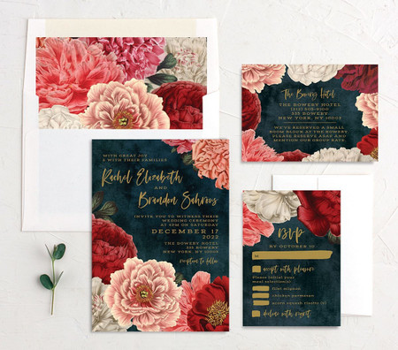


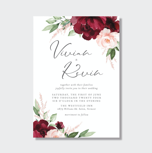
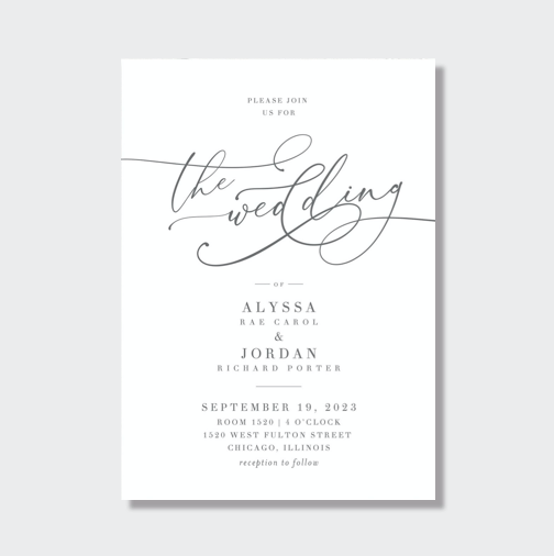
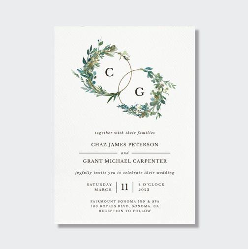
Hey ladies and gents,
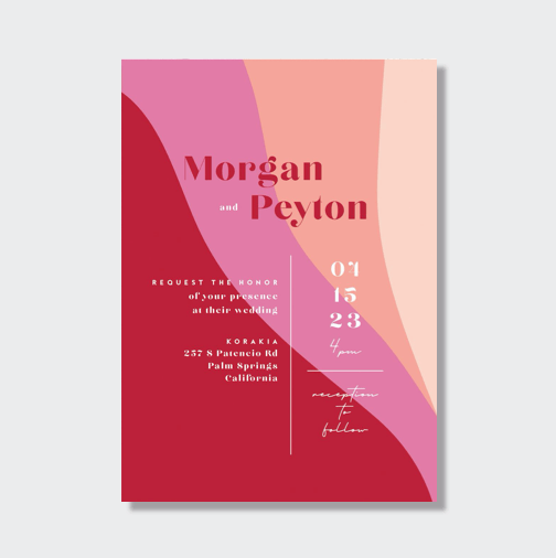
Any ideas on how to spruce up my invitations? Do you think they need some sprucing up?

Get the WeddingWire app
Plan your wedding wherever and whenever you want on the WeddingWire app.Complete your wedding team
Destination Weddings
Easily plan your international wedding.2024 Couples' Choice Awards
Check out this year’s best local pros, rated by couples like you.Find wedding inspiration that fits your style with photos from real couples
Sit back and relax with travel info + exclusive deals for the hottest honeymoon destinations
Featured designers
To unblock this content, please click here